In my 2+ decades of tattooing I’ve occasionally been asked by my clients & friends to do graphic design or illustration work for their projects, usually for a band logo or a side hustle. I’ve always been reluctant to take up these projects because tattooing is very different from design in both my process and the structure by which you charge a client. Still, every once in a while, I would say yes to a project if I had the time, was excited by the project, and had a vision for the design that the client agreed on. One of the last times I was commissioned for a project was in 2019 for this sticker design for my friend Aron Moxley’s fundraising.


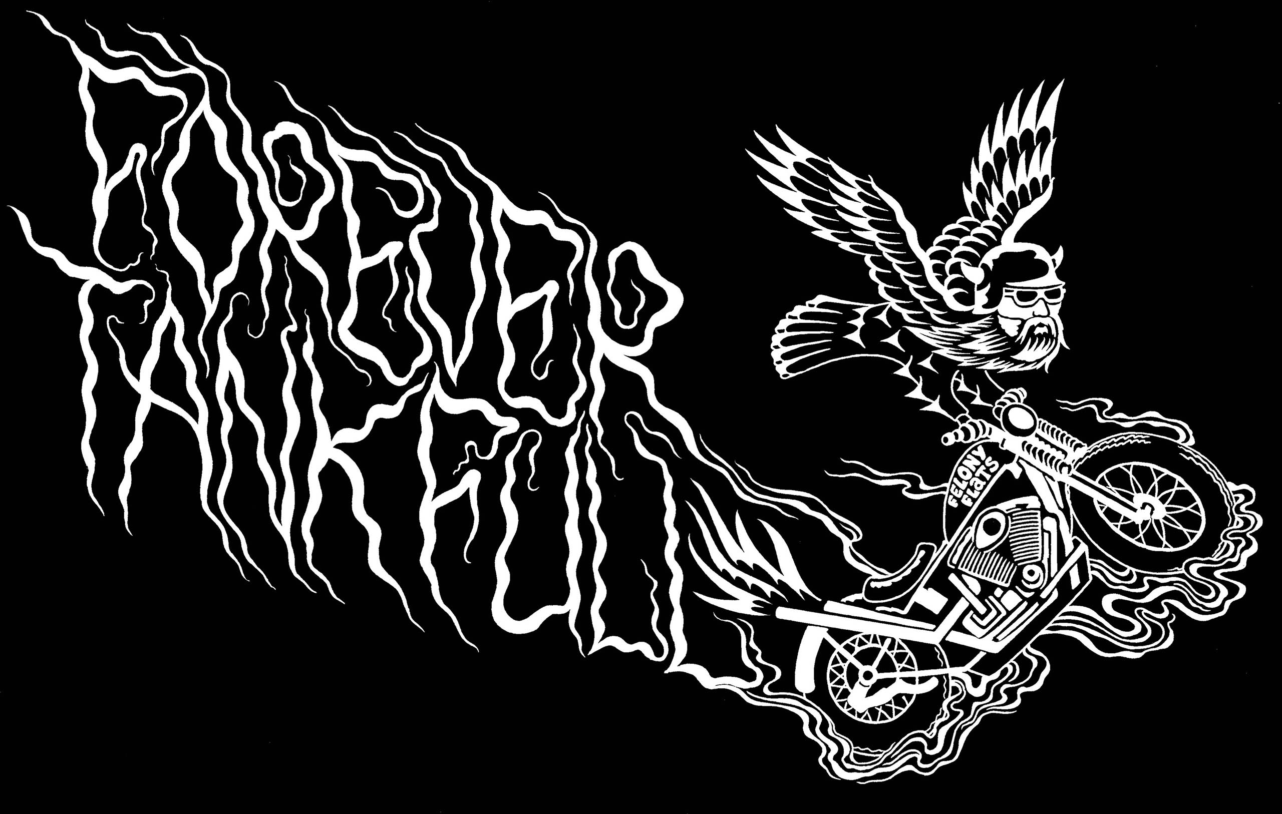
This project started with a painting I made in 2017. Some time ago, Washington tattoo artist Abram Nelson gifted me a collection of 1980’s Spaulding & Rogers tattoo flash, including some weird biker flash that struck a chord with me, and along with seeing old pictures of bikers doing stunts I was inspired to make this weird little guy:

Immediately after posting the painting on Instagram my friend Aron messaged me about it. I met Aron back when he was bartending in the Woodstock neighborhood and spent a bit of time watching fights with him at Belmont Inn back when I followed MMA. While I could go into detail about how much of a badass he is but I’ll leave it up to this Portland Monthly article from 2020 to highlight it a bit instead. The painting is now his, and a couple years later he brought it back into the shop to ask me to turn it into a sticker or shirt design for a fundraising project.

My 2 main challenges for this sticker were to come up with a white-on-black design and to faithfully represent a motorcycle. Motorcycles aren’t easy to draw unless you understand the mechanics behind them. Thankfully we were basing the motorcycle on Aron’s bike, and I was able to get helpful critiques from him along the way to make sure I wasn’t missing any important parts. As far as designing a white-on-black image, this was much more difficult than it needed to be. My initial drawings needed to be redrawn as a negative image of the result. This process took longer than expected and would lead me to finally buy an iPad so that I could start doing my design work in Procreate, which would have taken me a fraction of the time.


In the end, I was able to showcase my custom lettering while learning some hard lessons around the design process. In a lot of ways, this project was an impetus for me to start working digitally, which directly led to me starting the graphic design program at Mt. Hood Community College.

